When, why, and how the business analyst should use linear regression
The particularly adventurous business analyst will, at a fairly early point in her career, hazard an attempt at predicting outcomes based on patterns found in a particular set of data. That adventure is usually undertaken in the form of linear regression, a simple yet powerful forecasting method that can be quickly implemented using common business tools (like Excel).
The Business Analyst’s newfound skill — the power to predict the future! — will blind her to the limitations of this statistical method, and her inclination to over-use it will be profound. Nothing is worse than reading analysis based on a linear regression model which is clearly inappropriate for the relationship being described. Having seen over-regression cause confusion, I’m proposing this simple guide to implementing linear regression that should hopefully save Business Analysts (and the people consuming their analyses) some time.
When is linear regression appropriate?
The sensible use of linear regression on a data set requires that four assumptions about that data set be true:
- The relationship between the variables is linear.
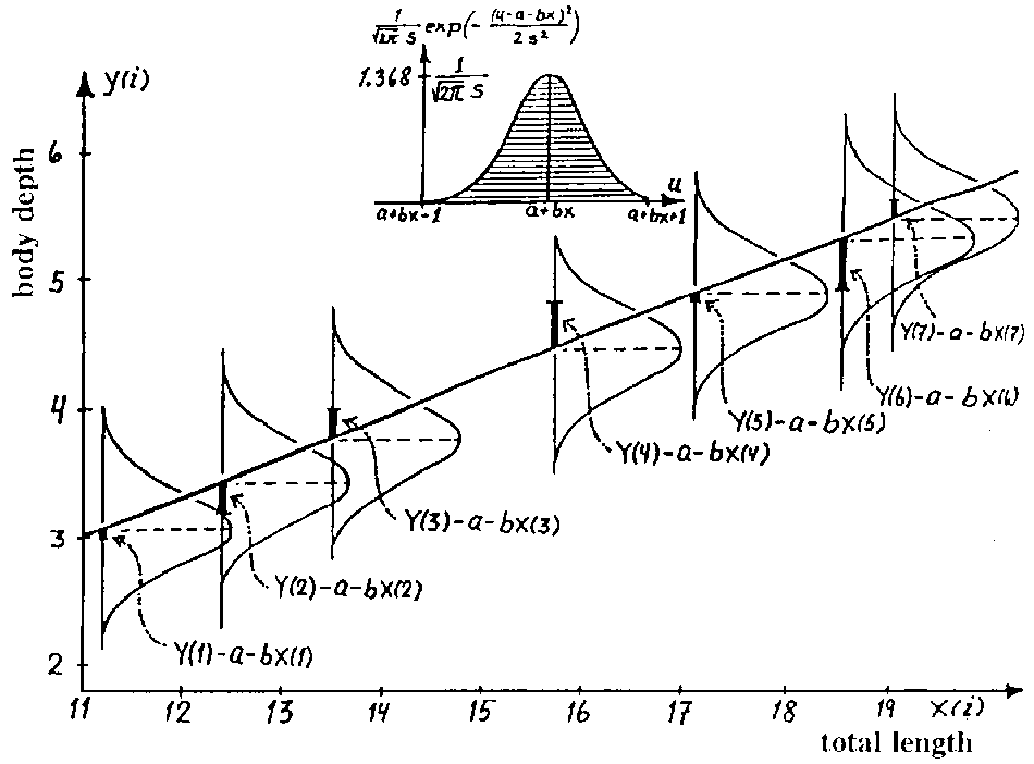
- The data is homoskedastic, meaning the variance in the residuals (the difference in the real and predicted values) is more or less constant.
- The residuals are independent, meaning the residuals are distributed randomly and not influenced by the residuals in previous observations. If the residuals are not independent of each other, they’re considered to be autocorrelated.
- The residuals are normally distributed. This assumption means the probability density function of the residual values is normally distributed at each x value. I leave this assumption for last because I don’t consider it to be a hard requirement for the use of linear regression, although if this isn’t true, some manipulations must be made to the model.
The first step in determining if a linear regression model is appropriate for a data set is plotting the data and evaluating it qualitatively. Download this example spreadsheet I put together and take a look at the “Bad” worksheet; this is a (made-up) data set showing the Total Shares (dependent variable) experienced for an item shared on a social network, given the Number of Friends (independent variable) connected to by the original sharer. Intuition should tell you that this model will not scale linearly and thus will be expressed with a quadratic equation. Indeed, when the graph is plotted (blue dots below), it exhibits a quadratic shape (curvature) which will obviously be hard to fit with a linear equation (assumption 1 above).

Seeing a quadratic shape in the real values plot is the point at which one should stop pursuing linear regression to fit the non-transformed data. But for the sake of example, the regression equation is included in the worksheet. Here you can see the regression statistics (m is slope of the regression line; b is the y-intercept. Check the spreadsheet to see how they’re calculated):

With this, the predicted values can be plotted (the red dots in the above graph). A plot of the residuals (real minus predicted value) gives us further proof that linear regression cannot describe this data set:

The residuals plot exhibits quadratic curvature; when a linear regression is appropriate for describing a data set, the residuals should be randomly distributed across the residuals graph (ie should not take any “shape”, meeting the requirements of assumption 3 above). This is further proof that the data set must be modeled using a non-linear method or the data must be transformed before using a linear regression on it. This site outlines some transformation techniques and does a good job of explaining how the linear regression model can be adapted to describe a data set like the one above.
The residuals normality graph shows us that the residual values are not normally distributed (if they were, this z-score / residuals plot would follow a straight line, meeting the requirements of assumption 4 above):

The spreadsheet walks through the calculation of the regression statistics pretty thoroughly, so take a look at them and try to understand how the regression equation is derived. If faced with this data set, after conducting the tests above, the business analyst should either transform the data so that the relationship between the transformed variables is linear or use a non-linear method to fit the relationship.
The “Good” linear regression model
Now we’ll take a look at a data set for which the linear regression model is appropriate. Open the “Good” worksheet; this is a (made-up) data set showing the Height (independent variable) and Weight (dependent variable) values for a selection of people. At first glance, the relationship between these two variables appears linear; when plotted (blue dots), the linear relationship is obvious:

And the residuals plot exhibits the “randomness” I described above:

As expected, the residual normality plot depicts a nearly straight line, meaning the residuals are normally distributed:

Some considerations the business analyst will want to take when using linear regression for prediction and forecasting are:
- Scope. A linear regression equation, even when the assumptions identified above are met, describes the relationship between two variables over the range of values tested against in the data set. Extrapolating a linear regression equation out past the maximum value of the data set is not advisable.
- Spurious relationships. A very strong linear relationship may exist between two variables that are intuitively not at all related. The urge to identify relationships in the business analyst is strong; take pains to avoid regressing variables unless there exists some realistic reason they might influence each other.
I hope this quick explanation of linear regression will be found useful by business analysts looking to add more quantitative methods to their skill set, and I’ll end it with this note: Excel is a terrible piece of software to use for statistical analysis. The time invested in learning R (or, better still, Python) will pay dividends. That said, if you must use Excel and are using a Mac, the StatsPlus plugin provides the same functionality as the Analysis Tookpak on Windows.
Comments: